|
This is the assignment labeled "Lightskyblue Mission". 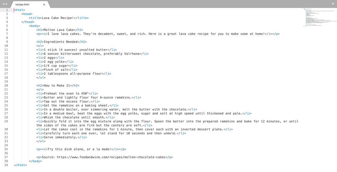 
0 Comments
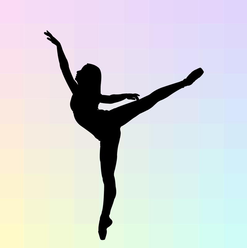
This is the poem assignment, or "Teal Mission", from Schoology.   I was asked to create three variations of three logos that I created. I think that the most frustrating part of this was that I wanted to make a very complex art piece, but tried to make it simple, as it is a logo. I also didn't like the disproportionality of everything. I thought it was relaxing that I could create something simple, though. The shading is my favorite part, I liked creating the compound shape to make the blocky shading. I didn't really find a great revelation, but instead practiced old techniques that I have learned in the past. I don't really like these designs, but everything is a learning experience. 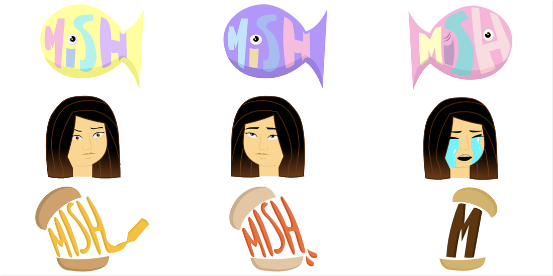 I went off of the nickname my friends give me, "Mish the Fish". My brand is lively and loud, which I think are good adjectives for my personality. The logo represents my brand because it's a fish with "Mish" in it, again going off of the nickname. This logo has my favorite color scheme and design out of all of them. I like how the colors look against each other. It looks fairly pleasant. Again, this isn't my best design, but everything is something I can learn from. 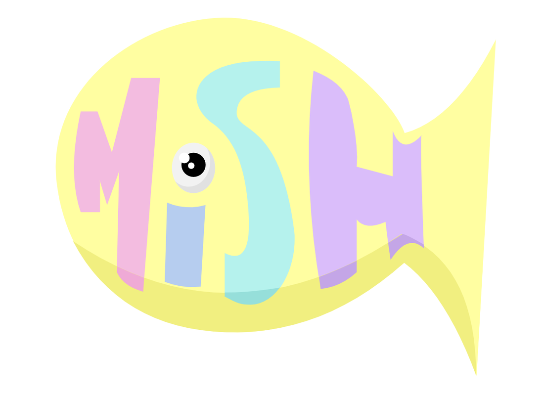 I decided to make a brand for me, "Mish the Fish", as my friends call me. I chose the "Mish", shaped in a fish, the icon of me being confused, and the burger. The first represents "Mish the Fish", as stated before, the second represents me being confused/shocked all the time, and the burger represents my love for burgers. I liked the simplistic ones because they remind me of real logos, however I would like to add some complexity to some of them. I didn't particularly dislike any specific logo, however I liked some more than others. The first 10 came up very quickly, although I noticed that the 11th-15th did not really meet my criteria as much as the first 10, perhaps since I ran out of ideas. Nevertheless, I enjoyed the process. 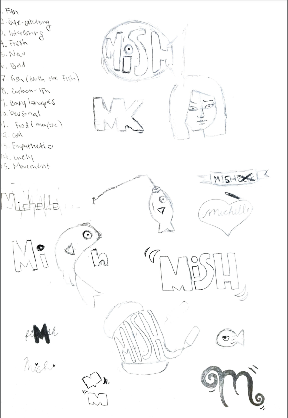 Color Names SummativeFor the Color Names Summative, we were asked to either make a 15-color illustration, make 3 5-color illustrations, or just make a list/lineup of 15 colors, all with the hex code and RGB of each color listed. As much as I would like to take credit for the beautiful outfits, I traced the outfits from the artist Chesiart. I created the face from scratch, however. I faced some challenges with creating a good color combination between the complexion, hair, and accents (stars on face, clothes, and eyes). I created swatches to see if the colors were aesthetically pleasing together. I like the look of the folds on the clothes, although I was tracing, it was hard to achieve the look of folds when not given the freedom of drawing. I used mainly the pen tool when creating this. 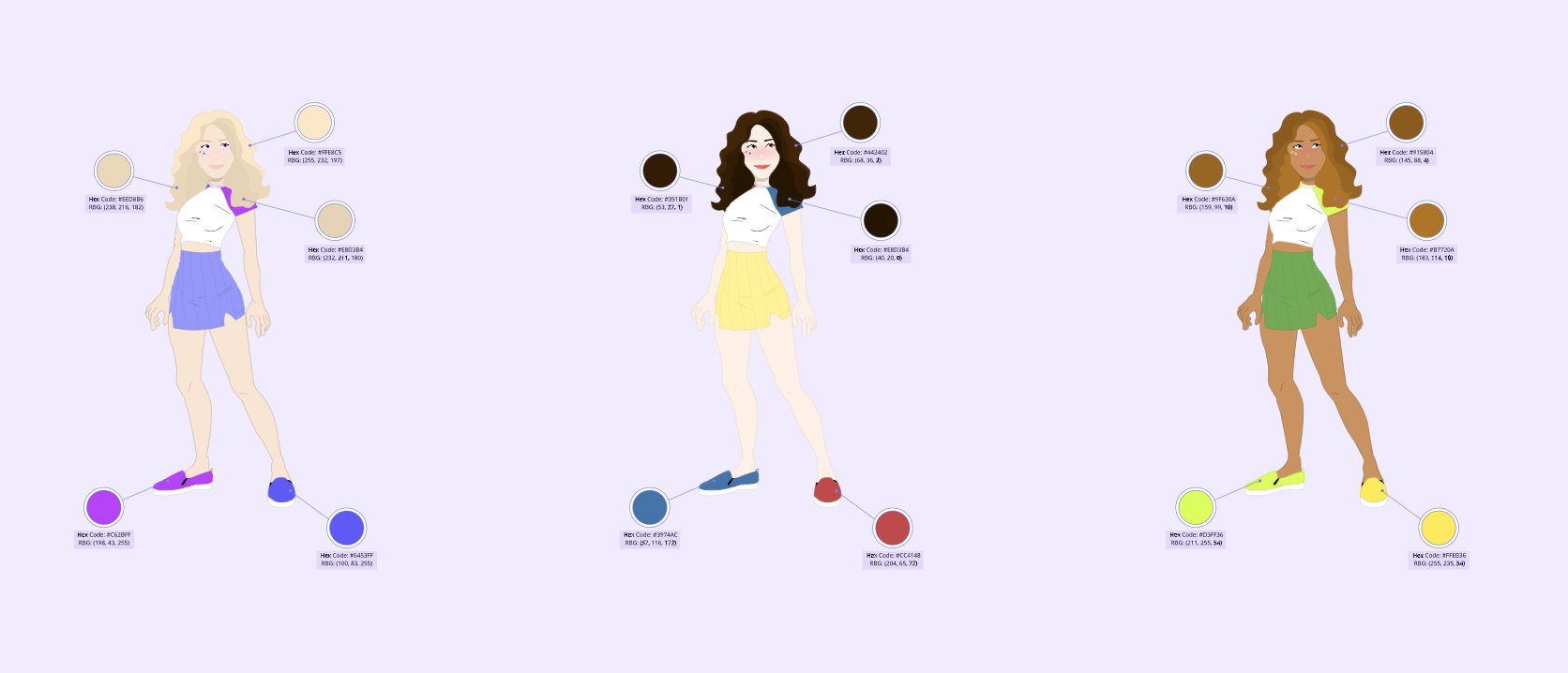 Color Schemes SummativeWe were asked to make either an illustration or samples of 4 different types of color schemes. I quickly drew a line art, then took a picture using Photo Booth. I traced the photo on Gravit and added color. I think a challenge for this project was that I didn't draw very straight lines and the face shape was a bit off initially, so I had to work with the more "robust" design. I made some edits to the design to try to make the design more pleasing and proportional. I like how the hair looks. I used the pen tool again. My inspiration was based off of the song "Something For Your M.I.N.D" by Superorganism. 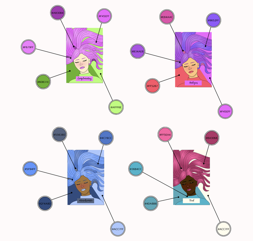 In short, typography is the technique of making designs legible and eye-catching. Typography is important because typography has different moods in itself, and therefore can make a formal letter seem cartoonish and child-like with just one design choice. The quote, "Each font has a personality and purpose" is essentially saying the same thing, that one click can make for a completely different mood depending on the font you pick. In class, we learned about five of the many different typefaces: serif, sans serif, monospaced, handwriting/script, and novelty. Serif is text with "feet", and are used in large blocks of text, such as a newspaper or a school project. Serif font is rarely used in a website article due to it being relatively hard to read on a screen. Sans serif font, on the other hand, has no feet and is used online, as I stated before, because it is easy to read quickly, also in that sans serif fonts tend to be more "neutral", making for a versatile typeface that is used just about everywhere on the internet. Although many serif and sans serif fonts tend to look like all the characters are the same size, they, in fact, aren't! Monospaced font is the only typeface (that we learned) that has characters of the same size. Monospaced fonts are used in coding because it is easier to read in hundreds and hundreds of lines of code, however does not work well in settings other than coding. Script/handwritten fonts aren't used in coding, newspapers, or articles, but instead commonly found in logos, headlines, and details. These types of fonts should be used sparingly because it can sometimes get difficult to read. The final font we learned was the novelty font group, which is the "trendy", so to speak, font. Their popularity comes and goes, however they are great attention-getters. Novelty fonts should be used sparingly as well, for the same reason as the script/handwritten fonts: they are difficult to read in large bodies of text. Typeface ComparisonIn this project, we were instructed to find examples of all five font types. We also had to put the type of font and the name of the font with the given font. 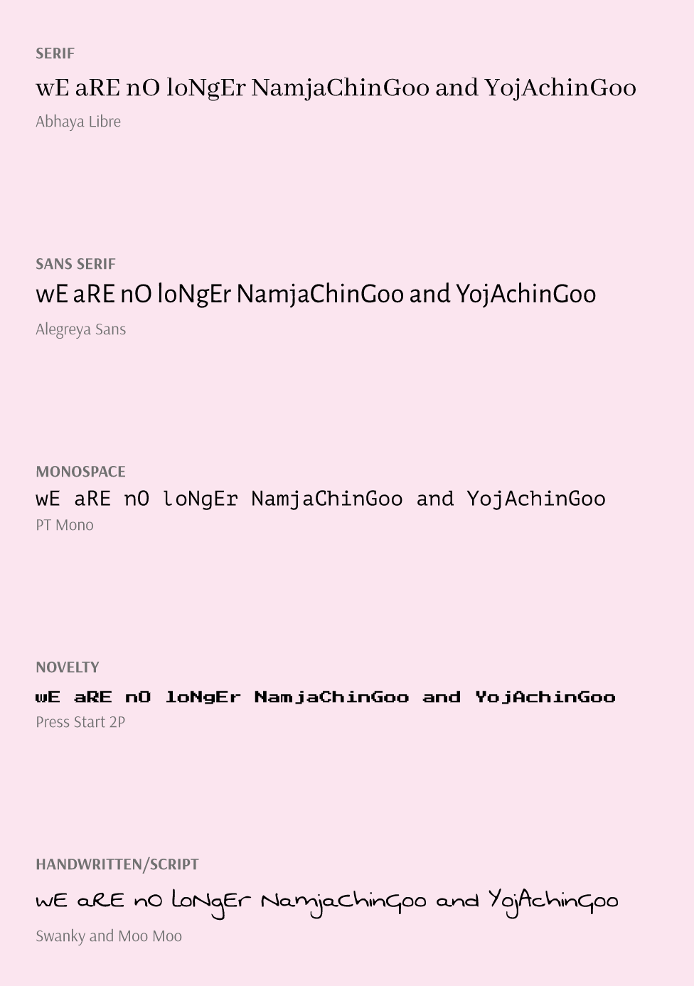 Word PortraitsIn this project, we were instructed to find a font and the word that was associated with the font type, and another word that was the opposite of the word associated. 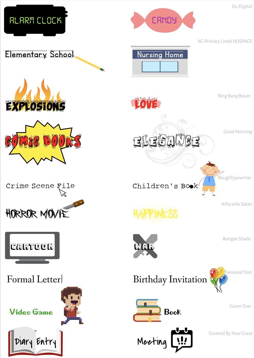 Using the pen tool on Gravit, we were instructed to trace 9 basic shapes, then to trace a penny, and finally to cut out one complex shape and paste it onto another background picture. I also did the optional monster tracing exercise. The pen tool is a tool that can create any shape, and is handy in tracing or creating images from scratch. The final image I cut out is a cartoon boy falling off a cliff while another man laughs at him. A challenge that I immediately had to face was that Gravit only has a certain amount of pixels, so getting very precise is difficult. Especially on a cartoon, many of the lines on the edge of both characters had to be cut out, or else the background of the original character's image would be present in the current picture. 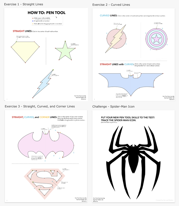 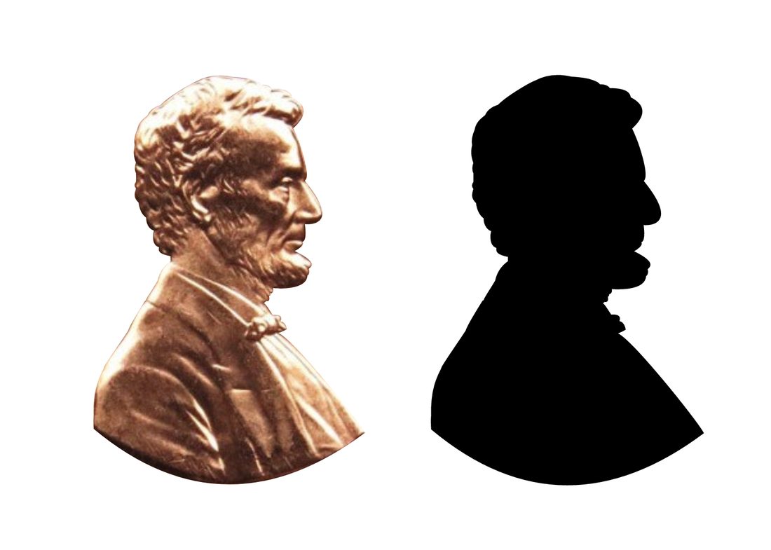 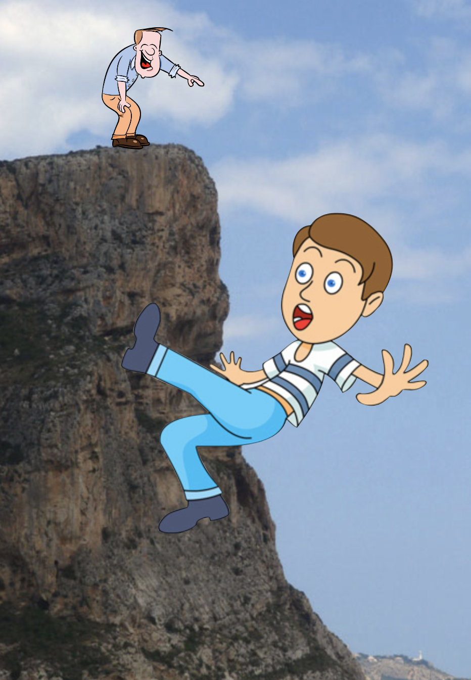 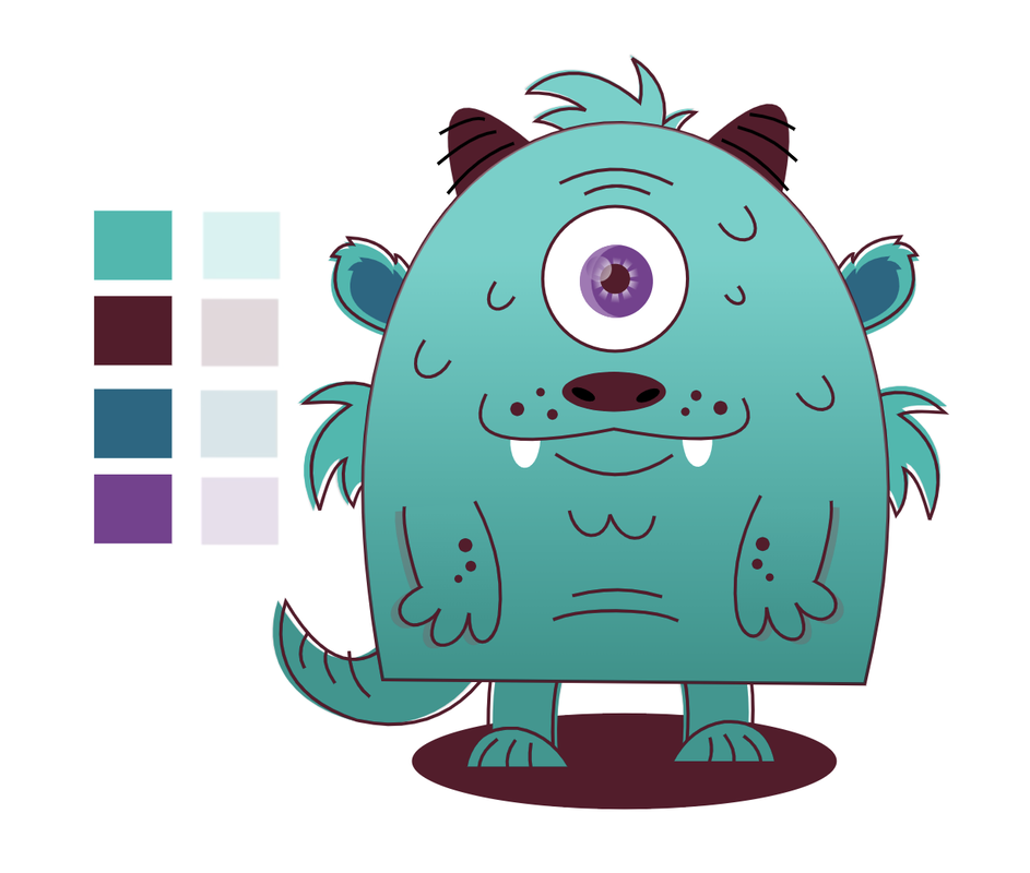 Hi, I couldn't resist myself, I have been on Gravit all day! Oops. The 2nd image is what I traced the eyes off of. 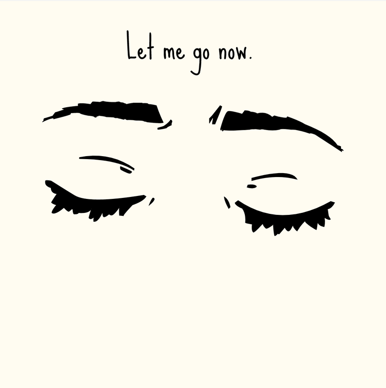 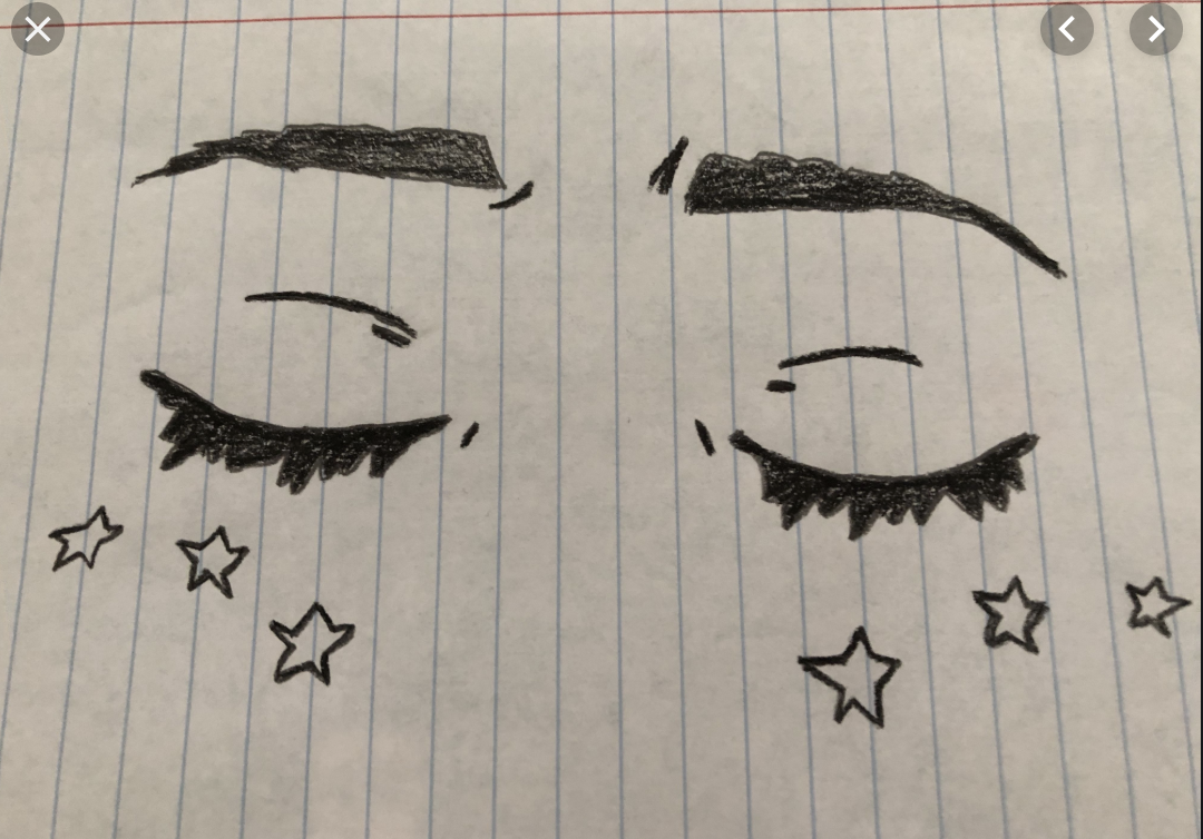 Merry Christmas, everyone! For the holidays, I decided to make a vector design on Gravit for fun. Here it is! 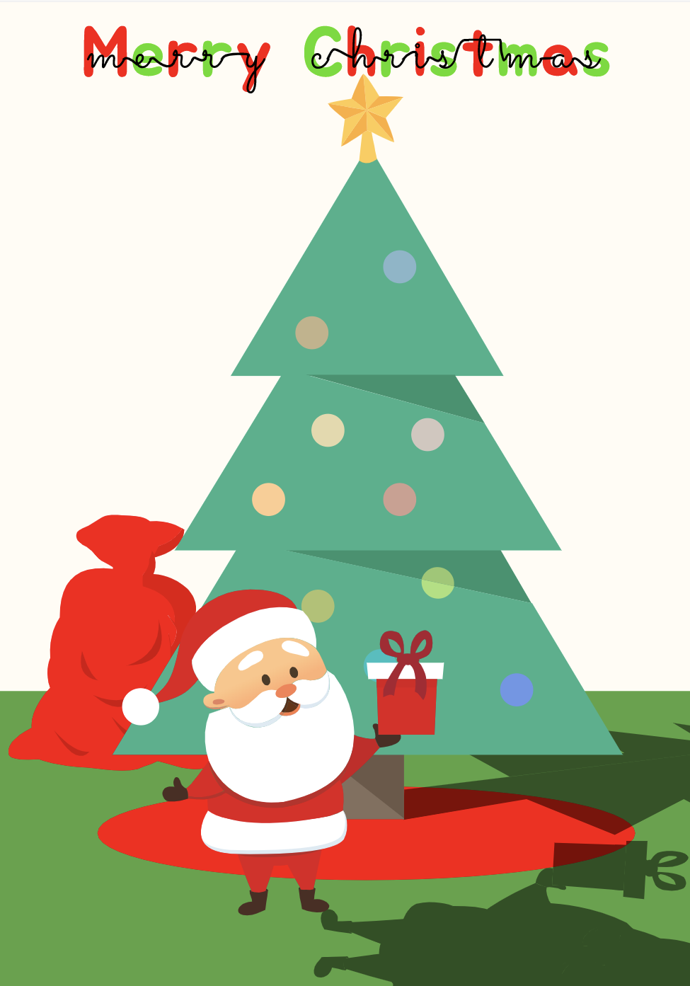 |
Archives
December 2019
Categories
All
 This work is licensed under a Creative Commons Attribution-NonCommercial-NoDerivatives 4.0 International License. |
 RSS Feed
