|
I was asked to create three variations of three logos that I created. I think that the most frustrating part of this was that I wanted to make a very complex art piece, but tried to make it simple, as it is a logo. I also didn't like the disproportionality of everything. I thought it was relaxing that I could create something simple, though. The shading is my favorite part, I liked creating the compound shape to make the blocky shading. I didn't really find a great revelation, but instead practiced old techniques that I have learned in the past. I don't really like these designs, but everything is a learning experience. 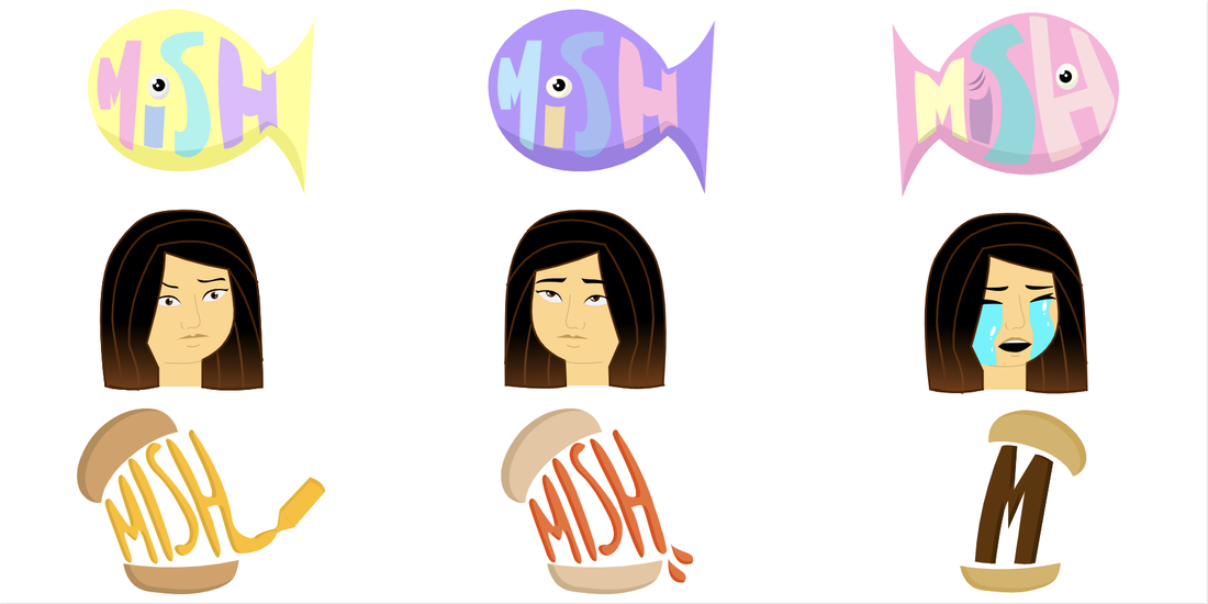 I went off of the nickname my friends give me, "Mish the Fish". My brand is lively and loud, which I think are good adjectives for my personality. The logo represents my brand because it's a fish with "Mish" in it, again going off of the nickname. This logo has my favorite color scheme and design out of all of them. I like how the colors look against each other. It looks fairly pleasant. Again, this isn't my best design, but everything is something I can learn from. 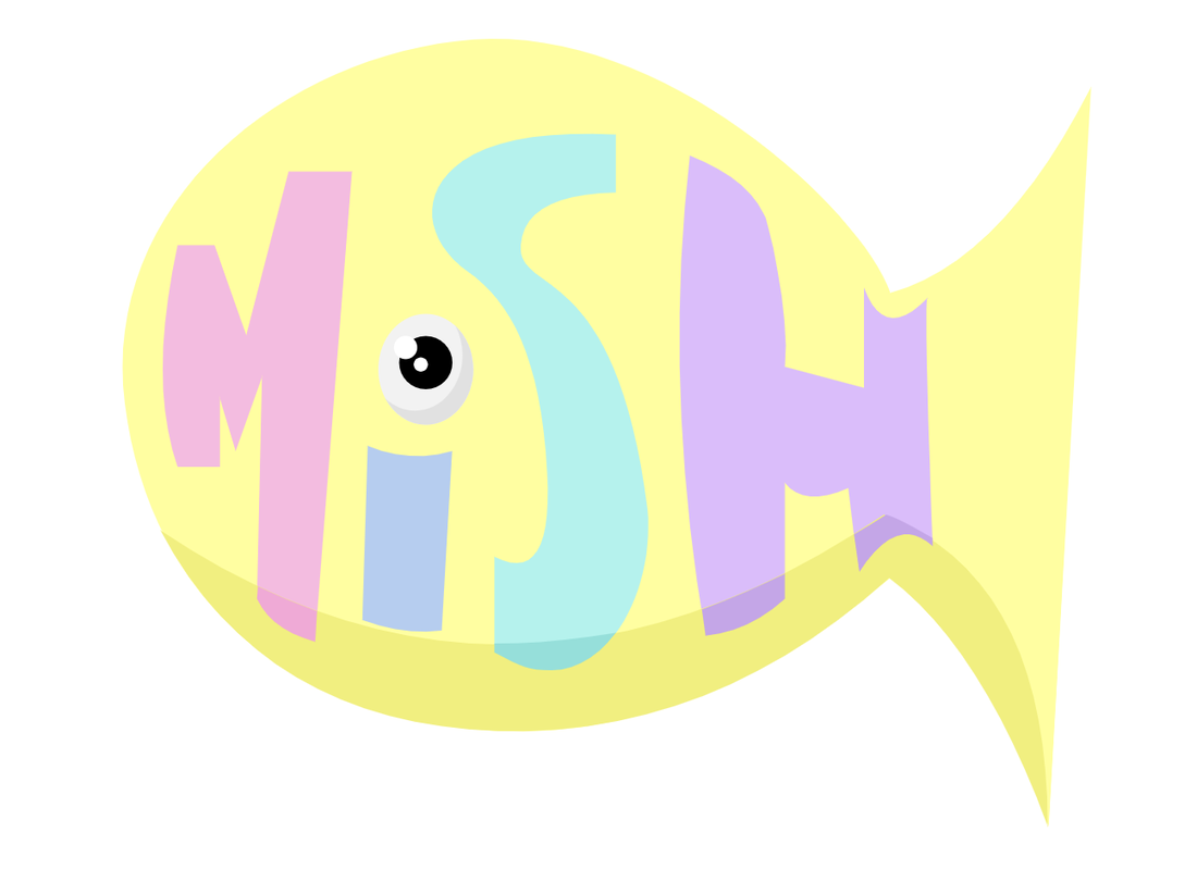
0 Comments
Leave a Reply. |
Archives
December 2019
Categories
All
 This work is licensed under a Creative Commons Attribution-NonCommercial-NoDerivatives 4.0 International License. |
 RSS Feed
